Friends of Chevalier Unveils New Logo to Celebrate the Organization’s Future
Friends of Chevalier unveiled a new logo at the organization’s 2024 Annual Meeting, introducing a refreshed identity that honors the history of Chevalier Theatre while reflecting the vibrant community that continues to bring the historic complex to life.
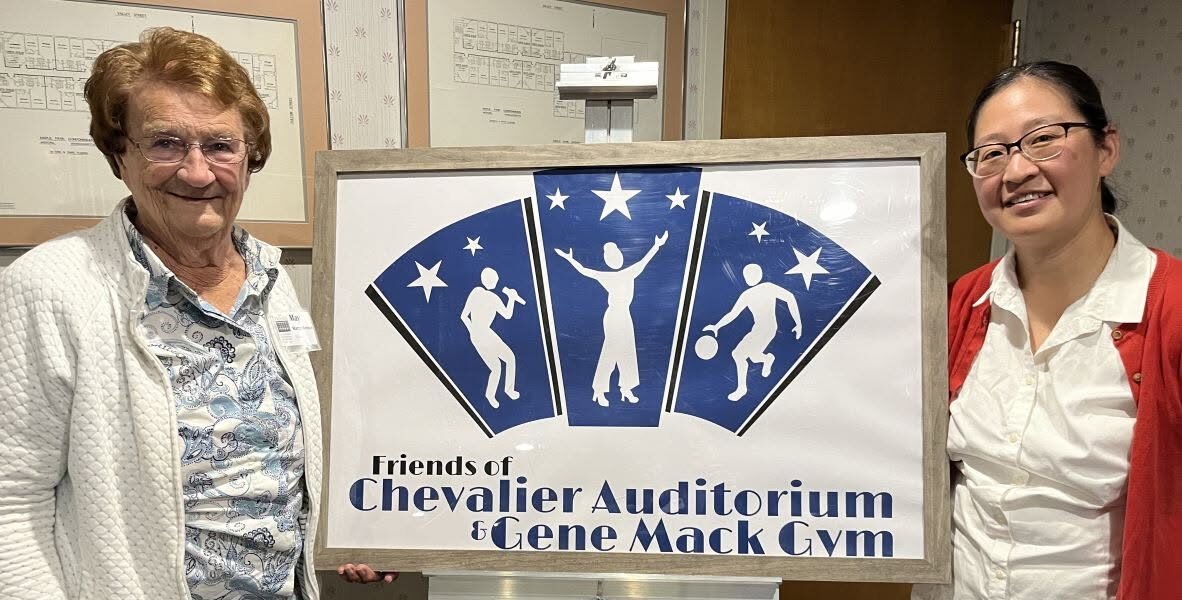
The new logo replaces the organization’s original logo, which served Friends of Chevalier for more than 30 years. It was created by Medford illustrator and graphic designer Jennifer Cheng DesAutels, who is also a teacher at Medford High School.
The redesign process began with identifying the key ideas the logo should represent: arts, sports and recreation, youth, activity, and vibrancy. The goal was to create a design that captured both the historic character of the c. 1939 Chevalier Auditorium and the excitement of the performances, programs, and community activities that take place there today.
According to DesAutels, the final design was developed through multiple rounds of feedback and refinement, resulting in a logo that celebrates the many ways Chevalier Theatre and Gene Mack Gym serve the Medford community.
“In the logo, the white silhouetted figures represent the wide variety of programming that happens all under one roof, ranging from music, comedy, silent movies, and dance to sports and community youth activities.”
The figures appear on a “Mustang Blue” background, a color that reflects Chevalier Theatre’s history as the former Medford High School auditorium. The fan-like shape of the design draws inspiration from the geometric, planar, and symmetrical Art Deco details found throughout the theatre’s interior.
The stars incorporated into the logo carry multiple meanings, representing the lights of the theatre stage and basketball courts, the star quality of performing artists, and the legacy of Lt. Commander Godfrey Chevalier, the World War I Naval hero and Medford High School graduate for whom Chevalier Theatre was named.
The logo’s typography also pays tribute to the theatre’s history. The design uses a variation of the Limelight font by Nicole Fally and Sorkin Type, an Art Deco-inspired typeface that evokes the style of the 1920s and 1930s and the connection between theatre and Hollywood filmmaking.
With this new logo, Friends of Chevalier celebrates more than three decades of community support while looking ahead to the future of Chevalier Theatre and Gene Mack Gym.
The updated design represents the organization’s ongoing commitment to preserving these historic spaces and supporting the arts, recreation, and community programs that make them such important parts of Medford.